Page 1 of 1
The everquest UI
Posted: Tue 20 Jul, 2010 10:36 am
by Nyim
Hello all,
I'm not sure if I used an alternative UI when I played many years ago, but the default everquest UI is just about driving me nuts. I really *hate* all the frilly bits and wasted space on its edgings etc, especially since I'm usually 2 boxing and playing windowed rather than full screen. I need to have separate chat boxes for combat and other chats to prevent useful information from scrolling off too fast, which doesn't leave a lot of screen space so the UI must be thin, sleek and lack the frills and useless decorations but provide functionality to place things where I need them (and hopefully the copy settings function works like it does with the default?).
I've had a look at the EQInterface site and there does not seem to be a lot that are being actively maintained past 2005 so I'm not sure I'd be all that willing to experiment especially since there's more than 1 patch since then that has broken non-standard UIs.
So what are people using these days? Are there any that are being actively maintained?
Cheers,
Posted: Tue 20 Jul, 2010 11:18 am
by varutia
I had just the reverse experience, tried a number of different UI, most actually take more space than default and less flexible on how you can arrange various of windows.
Everything in default can be switched on and off I think. I also made everything transparent, so it keeps my view without cluttering up the screen. I only have very minor modifications like showing exp percentage etc.
You do want to turn on a lot more filters if you feel stuff are scrolling too fast and do not want to set up more chat windows for it.
The bonus with default UI is that it never breaks, one less thing for you to worry about when playing.
Posted: Tue 20 Jul, 2010 11:50 am
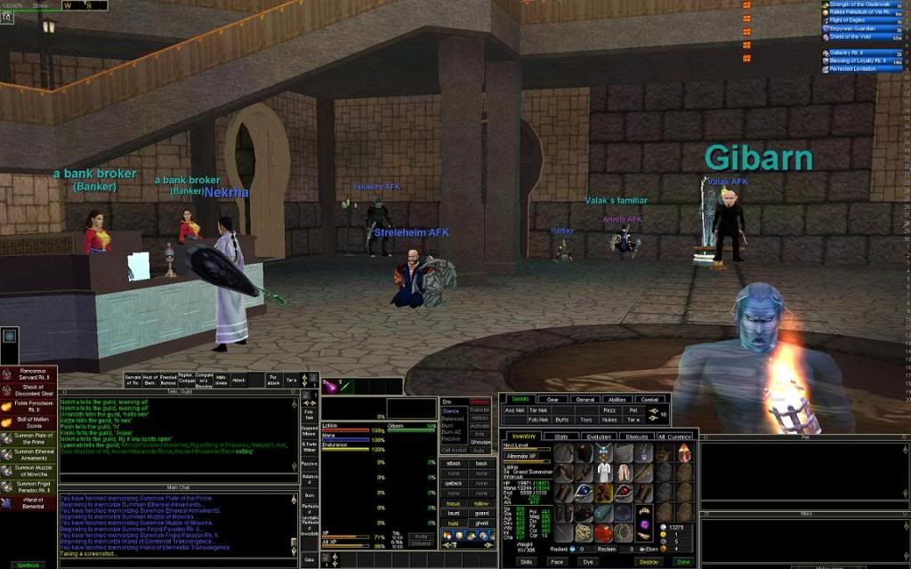
by Nekrha
I'm using sparxx. Simple, clean and up to date.
I'll post a pic later when I get back home.
Posted: Tue 20 Jul, 2010 12:09 pm
by kroe
I can't stand the default UI. I have never liked it.
For the last few years I have used UI's written by Drakah (currently using his TKing Celtic integrated UI). He seems to keep them updated fairly promptly.
Have a look anyway
http://www.shakahr.com/
Posted: Tue 20 Jul, 2010 5:59 pm
by curtis
In the guild movies section is also vertUI. I maintain it, usually with a day or two of patches at most. It is an update of the original vert 1.0 that vertically from TP made.
There are some peculiarities about it, as I am far from an experienced coder. but I like it, many others in guild do too. Not everyone of course. give it a go though. doesn't hurt anything to install it and ask me some questions.
Posted: Wed 21 Jul, 2010 4:17 am
by Saburo
kroe wrote:I can't stand the default UI. I have never liked it.
For the last few years I have used UI's written by Drakah (currently using his TKing Celtic integrated UI). He seems to keep them updated fairly promptly.
Have a look anyway
http://www.shakahr.com/
I'm with you Kroe,
I also use a Drakah UI. Though I prefer the looks of the WoW emulated (I know, I know but it just looks neat). He's pretty quick to get them updated though Sony rarely does anything that breaks UI's anymore since the majority of windows are not going to change dramatically.
Posted: Wed 21 Jul, 2010 10:05 am
by Nekrha
Sparxx ui on my mage box.

Posted: Wed 21 Jul, 2010 2:42 pm
by Nyim
Thanks for all the replies so far. Nothing I've tired yet I'm completely happy with, though I suspect some would be better if I played full screen or at least on a much larger monitor rather than in windows on a smaller one. So I'm still looking....

Curtis wrote:In the guild movies section is also vertUI.
me wrote:How does one get to the guild movies section?

i've looked around but no luck finding it so far.
Strike that, found the link in teeny writing on the side bar. hehe
Posted: Wed 21 Jul, 2010 6:55 pm
by Thoraf
hehe nice work super sleuth !

Posted: Thu 22 Jul, 2010 10:55 am
by Nyim
Virt is very nice, I can see why people use it. It has some really nice features there especially the spellbook - I always hated the default spellbook! - and the nice single panel hotkey/clicky bar. Still trying to work out which clickies you can put on that bar though, the slots seem to be fixed?
However it's slightly worse in terms of screen real estate use than the default for boxing/windowed use, and while its a vast improvement on the default UI, it's also unsuitable - I'm using it until I find something better regardless. I'm *still* looking....

I may end up with a hybrid of some type, using buff/song windows from a different ui and chat windows without the chunky borders. Those are the two problem areas.
BTW, is there any ui that doesn't put a text entry section on every chat window even if you have "always chat here" set on the main one?
Posted: Thu 22 Jul, 2010 11:30 am
by Thoraf
you can customise what clickies are presented by modding the XML.. curt knows how, it's a fairly simple process.
Posted: Thu 22 Jul, 2010 11:32 am
by Thoraf
there are also small icon buff bars... but they are small on a big screen. in the extra's folder
Posted: Thu 22 Jul, 2010 4:25 pm
by Nyim
Thoraf wrote:there are also small icon buff bars... but they are small on a big screen. in the extra's folder
Ooooh, ok.

That will make a difference.
it's won me if I can just get rid of the useless text entry bit on extra chat windows...
Posted: Thu 22 Jul, 2010 5:05 pm
by curtis
you cannot get rid of the useless text entry bit.
there are no smaller icon buff windows, there used to be, and there will be again, currently there are not.
If you like the style of window but don't want the customised windows, then delete the customised version from the vert folder and eq will use the default window but apply the vert scheme to the window. so slim titlebar etc. There is a "possibility" this may break the ui, but let me know the errors and I can see if we can work something out.
Posted: Thu 22 Jul, 2010 5:43 pm
by Feann
Curtis wrote:you cannot get rid of the useless text entry bit.
there are no smaller icon buff windows, there used to be, and there will be again, currently there are not.
If you like the style of window but don't want the customised windows, then delete the customised version from the vert folder and eq will use the default window but apply the vert scheme to the window. so slim titlebar etc. There is a "possibility" this may break the ui, but let me know the errors and I can see if we can work something out.
the version of sparxxUI that I used on my laptop got rid of the text input, I will point people in the right direction when I recover the data on it.
UI
Posted: Thu 22 Jul, 2010 6:10 pm
by Tartarus
I Use Aanaddors UI. It makes the Hotbars horizontal shows all your equipment and also all your stats. It's pretty good. I would post a pic but my EQ folder is invisible, true story, can't find it on my PC....
Posted: Thu 22 Jul, 2010 6:47 pm
by Creac
I used a ranger specific one when I was playing, that really suited me. It's still updated and has a beastlord specific version as well:
http://www.eqinterface.com/downloads/fi ... hp?id=3906
Posted: Thu 22 Jul, 2010 7:28 pm
by Mynks
I know a lot of people used to use lodi dodi and sparxx on 7th, but i dont think lodi is being kept up to date any more.
Posted: Sat 24 Jul, 2010 3:21 pm
by Nyim
Feann wrote:the version of sparxxUI that I used on my laptop got rid of the text input, I will point people in the right direction when I recover the data on it.
After trying it: sparxx UI is pretty slim with bags and such and has a lot going for it wrt meeting my needs. and chat windows are less chunky in general. Unfortunately the player/group windows are way too bloated with a ton of wasted space for my taste. :=/
I couldn't work out how to remove the text input field on chat windows though. There's a toggle for the scrollbar on the right click menu, but not for the text input. Does this require editing the XML also?
Posted: Tue 27 Jul, 2010 7:11 am
by Artreth

I use SARS UI.
Like the one already linked ... it is very minamilistic ... however you are unable to drag and drop text boxes, have to modify them by simply extending size to area you want it ... Group Window is very slim ... right across top of my two main chat windows ... Spell bars are also very small.
Link below to UI.
http://www.eqinterface.com/downloads/fi ... hp?id=4229

